Big Ideas,
Real Impact.
MY PROJECTS
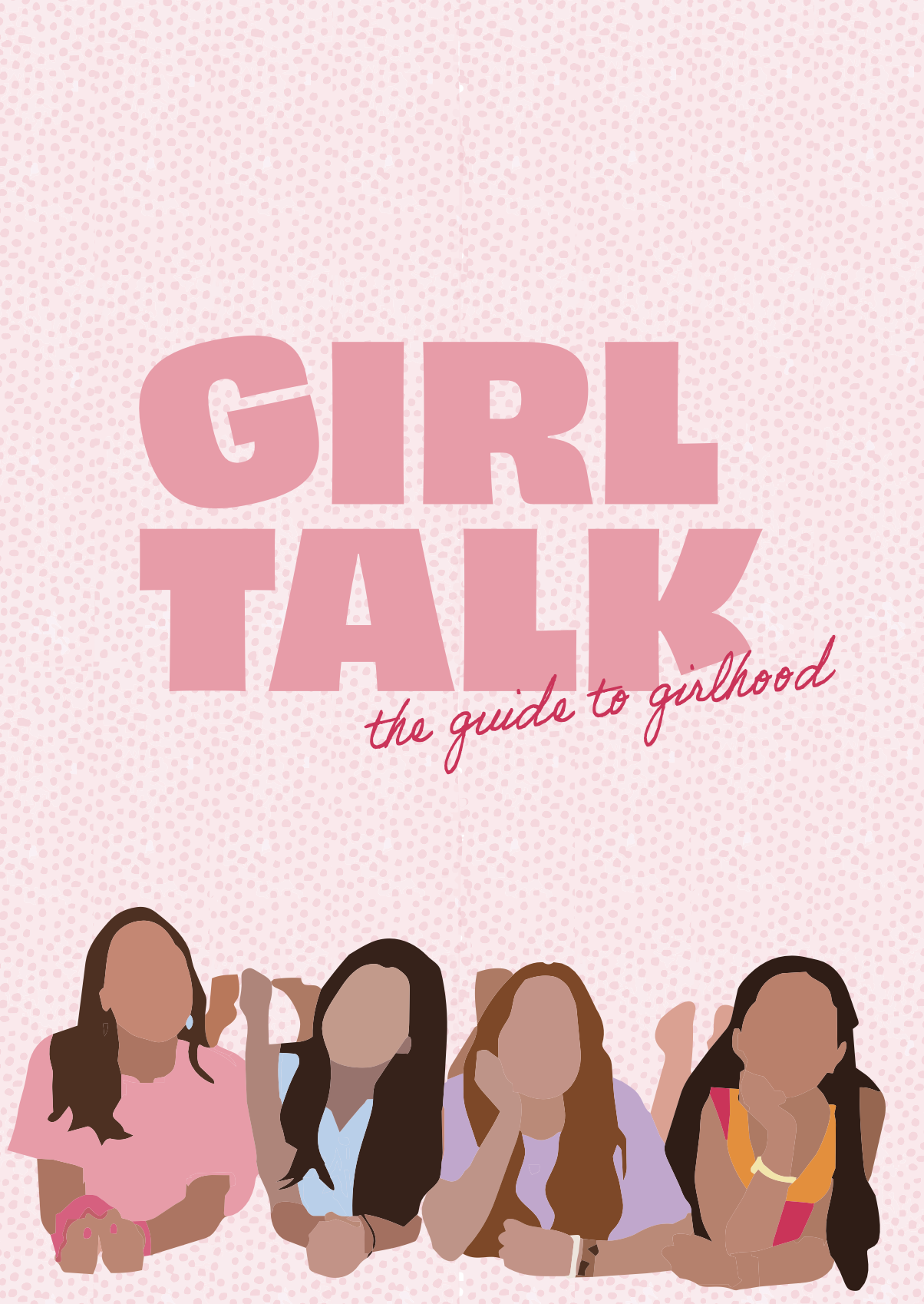
Girl Talk is a youth-focused brand and educational resource designed to support girls aged 10–16 as they navigate puberty, body changes, periods and friendships. The project combines a cohesive visual identity with a series of approachable educational guides and a digital website hub, transforming reliable health information into content that feels supportive, engaging and easy to understand.
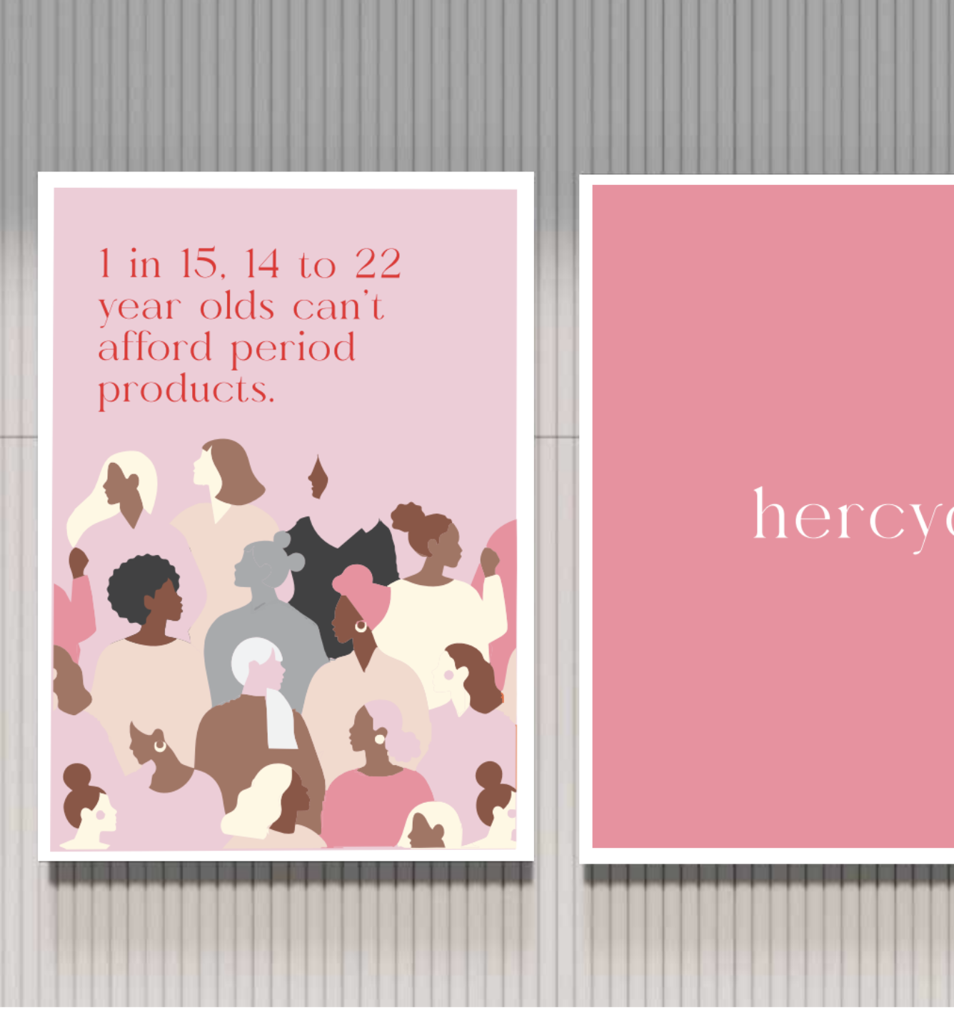
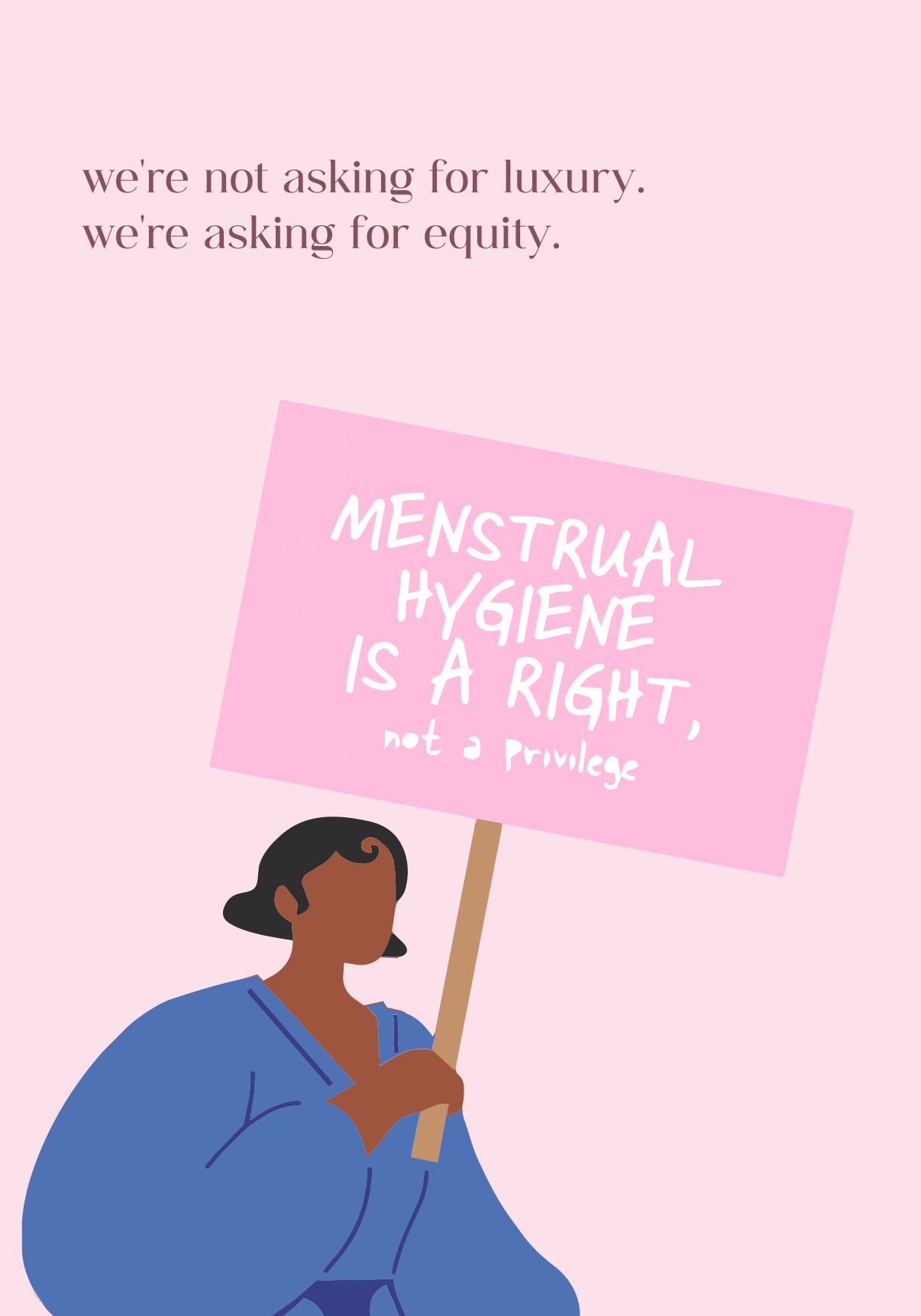
HerCycle is an augmented reality poster campaign designed to improve access to free menstrual products. By scanning each poster, users are guided through an interactive map experience that locates the nearest dispenser before transitioning to a mobile app call-to-action, combining advocacy with practical accessibility.
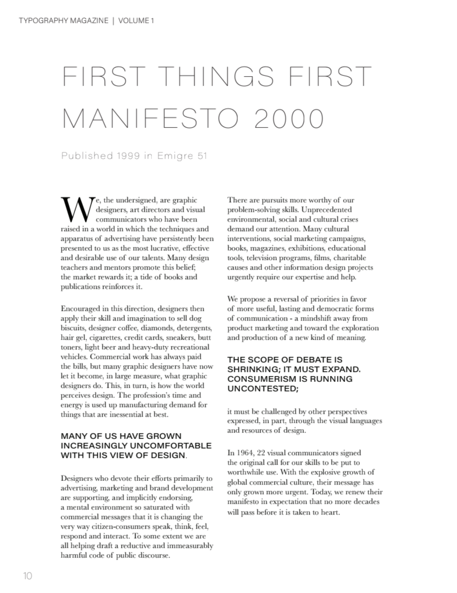
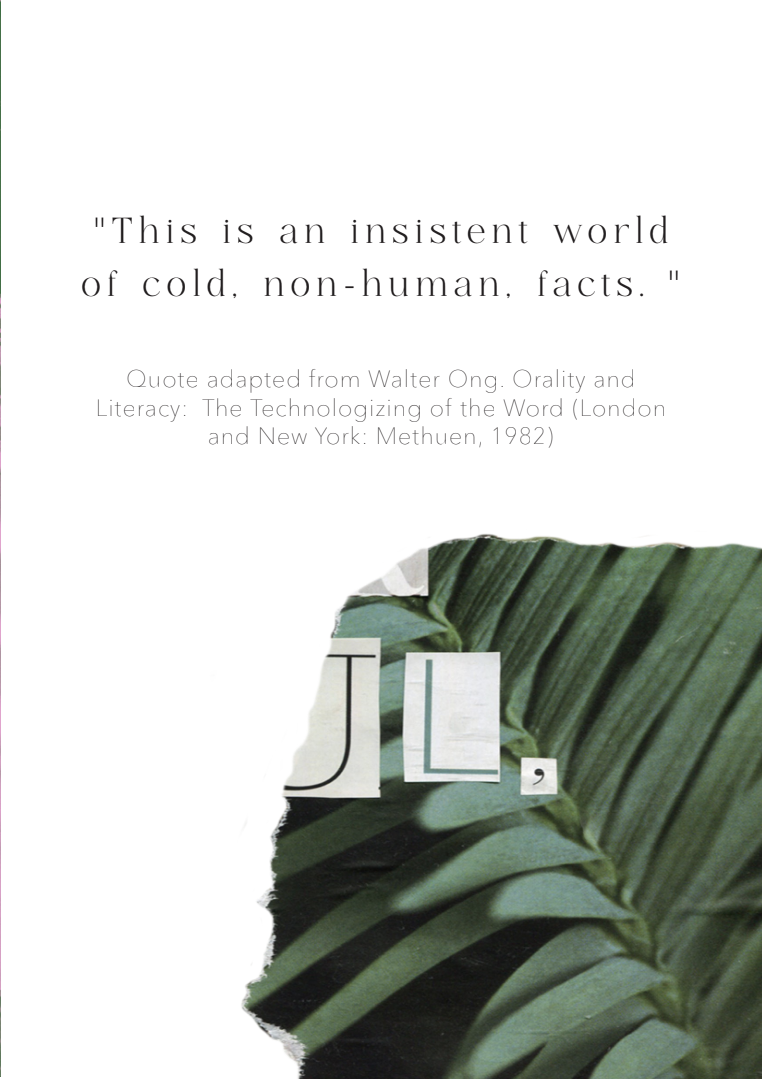
An early editorial design project centred around the First Things First Manifesto, exploring how design can communicate ideas beyond aesthetics. This magazine piece focused on layout, typography, and pacing to present written content in a visually engaging and thought-provoking way. It pushed me to think more critically about the role of design as a tool for communication and influence, rather than just visual output.
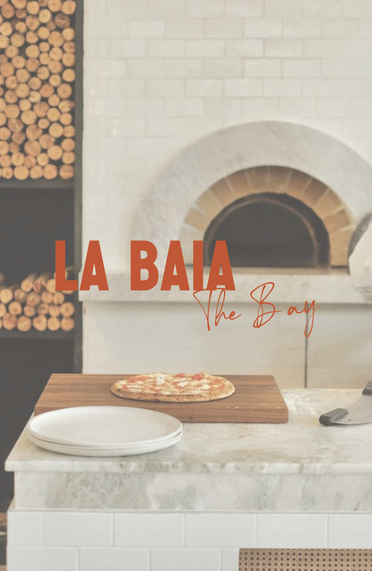
A UI/UX website concept for La Baia – The Bay Restaurant, designed to enhance the user journey from discovery through to booking. The project focuses on structure, navigation, and visual consistency, ensuring key touchpoints such as menu access and reservations are clear and accessible.
This work demonstrates my ability to apply user-centred design principles within a branded digital environment.
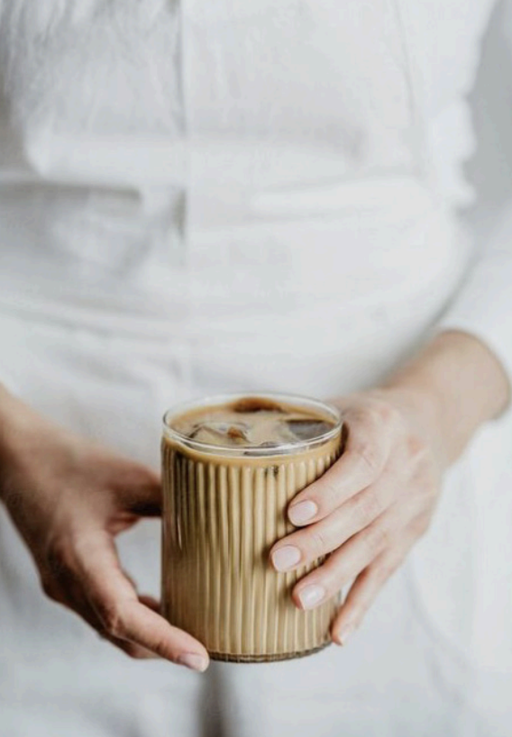
How to Brew was my very first university assignment — a coffee recipe book designed to break down different brewing methods in a clear, visually engaging way. Coming from a barista background, this project felt personal, allowing me to translate something I do every day into a structured design outcome. It was my introduction to typography, layout, and visual hierarchy, and marks the starting point of my design journey.
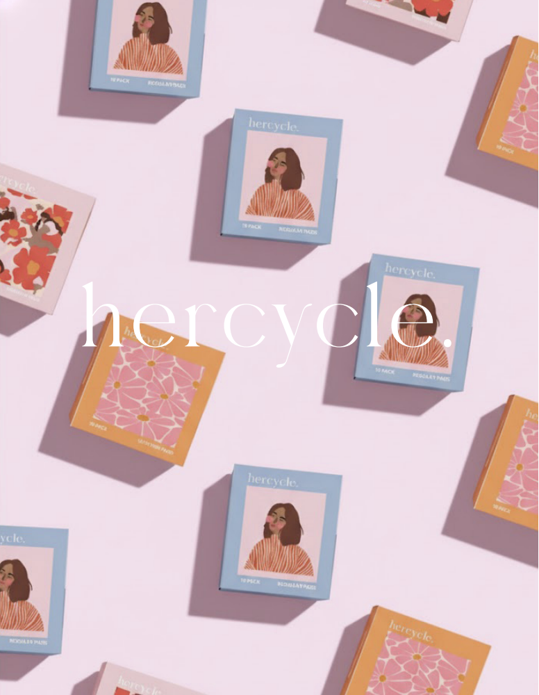
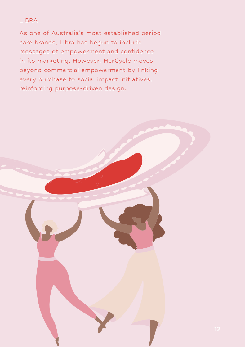
A comprehensive brand development project for HerCycle, focused on creating a purpose-driven identity within the menstrual health space. This portfolio explores brand strategy, visual identity, and tone of voice, with an emphasis on inclusivity, education, and breaking stigma. The project reflects my ability to build a brand from the ground up, combining design thinking with meaningful storytelling.
This booklet brings HerCycle to life, showcasing what the brand stands for and how it exists across different touchpoints. It includes mock-ups of packaging, website design, and brand applications, all working together to create a cohesive and recognisable identity.
I wanted it to feel like more than just a concept — something that could realistically exist. This project reflects my ability to think beyond a logo and build a brand world that feels consistent, intentional, and ready to connect with an audience.
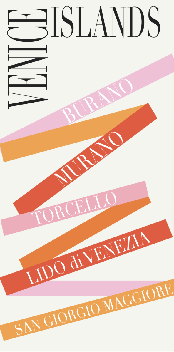
This project was all about capturing the energy and colour of Venice and translating it into a visually engaging campaign. Through a combination of bold imagery, layered typography, and editorial-style layout, I aimed to create something that feels immersive rather than just informative.
The poster draws attention, while the brochure expands on the experience, guiding the viewer through key attractions and cultural highlights. It reflects my approach to design as both visual storytelling and structured communication.
This project allowed me to experiment more freely with layout, typography, and collage-style design. I combined layered imagery with bold type to create a series of editorial spreads, alongside a monogram that ties the work together as a brand element.
I explored different colour variations and compositions to see how the same concept could shift visually while still feeling consistent. It reflects my interest in pushing design beyond strict structure and into something more expressive and visually engaging.